• Welcome to Overclockers Forums! Join us to reply in threads, receive reduced ads, and to customize your site experience!

OCF Benching Team t-shirts

Overclockers is supported by our readers. When you click a link to make a purchase, we may earn a commission. Learn More.

How much are you willing to spend on a T-Shirt?

  • $25 ($27 for 2XL)

    Votes: 10 71.4%
  • $27.50 ($29.50 for 2XL)

    Votes: 2 14.3%
  • $30 ($32 for 2XL)

    Votes: 1 7.1%
  • As Cheap As Possible - $18 ($20 for 2XL)

    Votes: 0 0.0%
  • Other?

    Votes: 1 7.1%

  • Total voters
    14
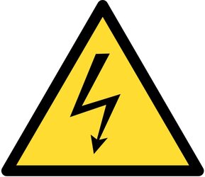
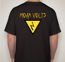
Upwards triangle like the legitimate voltage sign I posted earlier...

+1

Any chance one of you mods can find us a large version of the ocf logo? Also details on the MOAR VOLTS font would be great. We could also use a good, clean (large) version of the ocf lightning bolt, too. The only graphic that I think still could use some work is our upward triangle with the bolt inside it. Maybe a bit thicker than the one that devlos was kind enough to draft?

 
I have some files for this effort!

Whoever needs them, please PM me with your email and I can get them sent over.
 
I know this has been a long, pitaliscious process but please don't give up...we're almost there!

Good things come to those who wait.

I'm looking forward to the shirts :D

+1 to the front of the tee

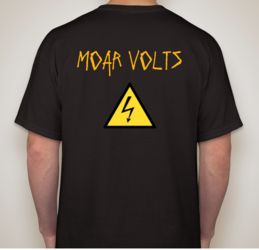
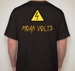
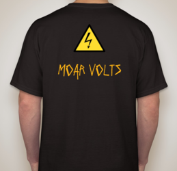
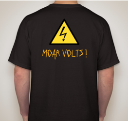
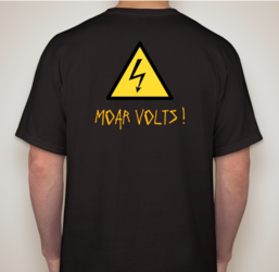
the back, I like the legit high voltage sign and "moar volts!" centered underneath.
 
How about this for the back? https://www.boundless.com/physics/t...azards-528-10948/images/high-voltage-warning/
(sorry...can't download/upload files from work)

Sounds like we have a consensus lock on the front of the t-shirt. I like the idea of the electrical hazard symbol on the back with "MOAR VOLTS!" underneath the symbol.

Do we want to use the symbol I linked? Anyone think it'd be better to use the symbol but replace the lightning bolt with the ocf bolt?

Getting there! Is there any way someone could get the ocf source files from ED and give us a nice horizontal overclockers logo with the flamey Benchmarking Team instead of "The Performance Computing Community"?
 
Man that Santa hat made me LOL. Nice one Witchy !
Just had to save that
1 witch.JPG
 
Been a bit busy so haven't had time to play with this....

As soon as we've got the following together, we're ready to request a quote:
- front mock-up (attached below...think we all agree on this?)
- rear mock-up (could use one of these if someone can nail one out)
- large OCF logo (best one I have is below)
- large flaming Benchmarking Team graphic (or 1 large graphic with ocf logo and 'benchmarking team')...best one from thread attached
- large electrical hazard graphic (attached)
- MOAR VOLTS! is the Mistral font in MSWord

Just need a rear mock-up and I think we're good to go?
 

Attachments

  • fronte.PNG
    fronte.PNG
    400.6 KB · Views: 69
  • Overclockers_cmyk_print.jpg
    Overclockers_cmyk_print.jpg
    72.5 KB · Views: 69
  • voltage.jpg
    voltage.jpg
    32 KB · Views: 70
  • ZaMnksK.png
    ZaMnksK.png
    290.6 KB · Views: 69
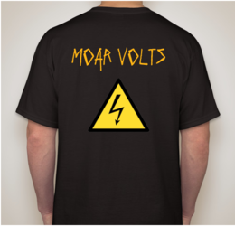
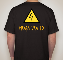
I think #2 or #5 gets my vote (I'm fine with the smaller logo on the back)
 
I wouldn't mind a better font, but thats the closest I could find.

Ive still got the tab open so I can easily make the text smaller, higher, lower, bigger, whatever.

That said. I like 5.
 
Last edited:
Thanks devlos!!!

I like #2...maybe slightly smaller font (is that 'mistral'?) with a single exclamation point after the word Volts?
 
Back