OK. I just heard from the printer. The original screens are gone. they get rid of screens after 2 years of inactivity. That should not be a problem as i should have the original files that i sent him. If i remember correctly this will add about 1-2.00 per shirt depending on how many shirts we order.
This does present an opportunity. Someone in the thread had mentioned that they would like a different front logo. If someone has a pic of the front of the shirt could they post it up? It will be a few days before i get home. I think it might be contest time!!!
I think everyone is happy with the back of the shirt, so lets see if we want to change the front of the shirt.
The T32 on the white shirt is gone. That was a thermal transfer and only really looks good on white t-shirts.
I've never seen the fit between a pirate-themed design, and folding to save lives. Crossed cutlasses and lifeless human skulls, have been used for hundreds of years - to symbolize ruthless killing and inspire abject fear in the victims.
Why exactly would we want to be identified with murdering pirates?
As for the crest - nobody reads Latin anymore, and crests went out of style 200 years ago, for the most part. They have no connection with FAH or our team. Let's not try and make one.
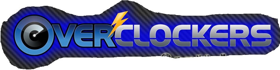
I'd like to see us move forward with a design that is modern (as we are), and connected with both Overclockers and it's website logo, and saying in English, "Folding@Home Team 32".
We can add or subtract colors, but it should take cost and overall fit with our website logo, into careful consideration.
We could start with this:
and replace "The Performance Computing Community", with "Folding@Home Team 32"
I believe we've found through experience, that finding a design for FAH is none too easy, and the printing of it, would be exorbitantly expensive. Simple text "Folding@Home Team 32" is fine.
If we can touch it up to approach the OC logo posted a few posts before this, then all the better. If that's too expensive, we won't go there. In the end, we'll have something we can be proud to wear.
I believe that the pirate theme came out of how much myself and a few others were borging computers at that time, hense my "captn morgan borging" avatar.
Since times have changed and the team and website have evolved I believe the shirts should too. The original screens are gone so any shirt we come up with the screens would have to be created anyway. I say lets hold a design contest and see what T32 can come up with. I would try to keep it basic to keep the price down, Something like the above logo would be better done with embroidery. there the colors would be easier but the shirts would be more costly. Lets see what kind of designs T32 comes up with and take it from there?
I'm not on T32 unfortunately But just to throw my 2c in anyway, I like the bottom black style with the logo on the back. Throws a little edge on what the general public peanut gallery views as an alpha-geek activity.
I am kind of stuck in the middle because I like the older shirt design, but I like the idea of a newly designed shirt as much. For a new shirt idea, on the front you could have the overclockers logo on the left chest using 2 colors. You could have the words done in either black or white depending on the shirt color, having the clock inside the O to match, and the lightning bolt done in yellow. On the back you could have the same logo done larger in the same manner, but instead of the performance computing community you could put "The Performance Folding Community" with a hollow Team 32 stamp looking thing over the Overclockers.? I don't know, just throwing some ideas out there
The pirate design came out of the mood of the forum at the time. The point system was just changing. they were just starting -adv and the bigpackets and back then it was more the number of systems you had folding that made the points difference rather than the hardware you had in the machine.
Most of the places i work are industrial and wearing a shirt like that to work is no big deal but i understand that the pirate motif is not for everyone. It's a new year so lets start off with a new shirt. I will open up a new design thread and lets see what we come up with.
On a side note. What would you spend on a T32 t-shirt?
It would be interesting to see what the avg members budget would be. That would help define the parameters of the design.
Does anybody know what font the "overclockers" is using? Or the closest font?
I do not know the font, but I could try to get you as close to a specific version of the logo as possible. Let me know your requirements - PSD, text only, etc.
This site uses cookies to help personalise content, tailor your experience and to keep you logged in if you register.
By continuing to use this site, you are consenting to our use of cookies.
")


 But just to throw my 2c in anyway, I like the bottom black style with the logo on the back. Throws a little edge on what the general public peanut gallery views as an alpha-geek activity.