-
Welcome to Overclockers Forums! Join us to reply in threads, receive reduced ads, and to customize your site experience!
You are using an out of date browser. It may not display this or other websites correctly.
You should upgrade or use an alternative browser.
You should upgrade or use an alternative browser.
OCF Benching Team t-shirts
- Thread starter funsoul
- Start date
- Joined
- Aug 30, 2014
$25 a shirt... wow.
heavy t-shirts with a design on the front and back they'd be something in the $20-25-ish range depending on what we want to do.
Just tryin' to be helpful, I have personally never ordered a custom shirt.
Not saying you were not helpful... just surprised at the pricing. Im still in, but figured the price would come down. Like I said, I order jerseys for $20 a pop. That said, the jersey's are likely silk screened and cheaper which is why. ")
- Joined
- Aug 30, 2014
Really only trying to give more ideas on the design. Just showing pricing because it was easy to access. No biggie.
There are a lot of options for fonts and text effects. (blade runner font with roof effect now) Just giving it a whirl. This http://www.customink.com/ is the site I used, funsoul's friend would be more trustworthy imo.
There are a lot of options for fonts and text effects. (blade runner font with roof effect now) Just giving it a whirl. This http://www.customink.com/ is the site I used, funsoul's friend would be more trustworthy imo.
- Thread Starter
- #165
Only trying to work on the design atm...thank you devlos!
Once we all agree on what we want, I'll get a real quote from my guy and we can take it from there. Just as an fyi...I gave him one of the ocf logos with benching team that was done for us, small on the front, large on the back just to get an idea of how much we were talking. Came out to $17 each.
Just so everyone feels good about this...I suggest we agree on what we want then everyone can go get quotes and we'll decide then who to go with.
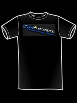
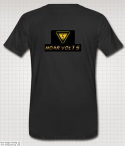
Only thing we've all agreed on so far is heaviest possible cotton, black, short-sleeved t-shirts with a smaller image on the front and a larger one on the back.
Once we all agree on what we want, I'll get a real quote from my guy and we can take it from there. Just as an fyi...I gave him one of the ocf logos with benching team that was done for us, small on the front, large on the back just to get an idea of how much we were talking. Came out to $17 each.
Just so everyone feels good about this...I suggest we agree on what we want then everyone can go get quotes and we'll decide then who to go with.
Only thing we've all agreed on so far is heaviest possible cotton, black, short-sleeved t-shirts with a smaller image on the front and a larger one on the back.
- Joined
- Apr 12, 2014
- Joined
- Sep 7, 2013
+1 Yes. Large forum logo on front.
- Joined
- May 29, 2005
I like the larger logo on the front, but I think it should be straight across and not diagonal. I realize that it was just a copy-paste, but from a design standpoint I think it would look better.
I also preferred the lightning arrow from devlos's images as it is closer to the bolt in the OCF logo
I also preferred the lightning arrow from devlos's images as it is closer to the bolt in the OCF logo
- Thread Starter
- #170
I like the larger logo on the front, but I think it should be straight across and not diagonal. I realize that it was just a copy-paste, but from a design standpoint I think it would look better.
I also preferred the lightning arrow from devlos's images as it is closer to the bolt in the OCF logo
Works for me! Can we get a new mockup?


- Joined
- Jul 15, 2014
That looks good devlos but could the benchmarking team be something other than yellow? Or has that color already been decided?

- Joined
- Jul 15, 2014
I'm good with whatever I was just curious. It looks great how it is
- Joined
- Aug 30, 2014
The only thing I think would be better is the "benchmarking team" part on the front should be the blue flames. I was not able to work with the samples here. It is possible though, if someone made it with a transparent back-ground and horizontal instead of angled.


- Joined
- Apr 12, 2014
Looks good
Similar threads
- Replies
- 51
- Views
- 2K
- Replies
- 4
- Views
- 332